

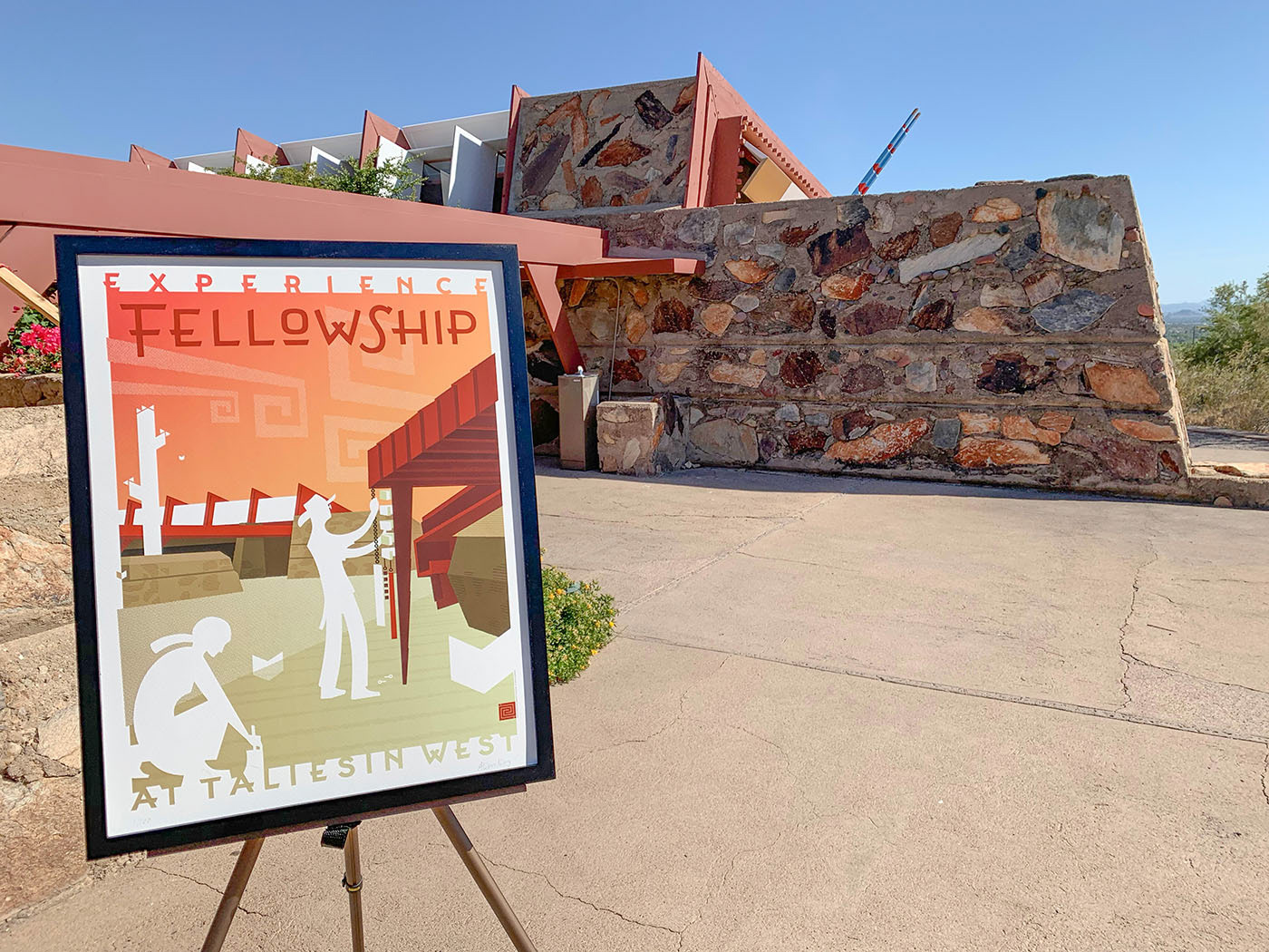
This 18X20" poster was commissioned by The Frank Lloyd Wright Foundation and Spoke Art Gallery to commemorate Wright-designed sites around the nation. The objective was to represent Wright's architecture in the manner of a late-30's era W.P.A. poster, which is one of my favorite time periods and styles.
Because architecture is nothing without the humans that inhabit it, I put the focus on the workers as they lovingly cared for this important UNESCO World Heritage Site. Are they in the 1930s creating it, or in the 2030s restoring and preserving it? The ambiguity reflects the name of the show it was commissioned for, "Timeless".
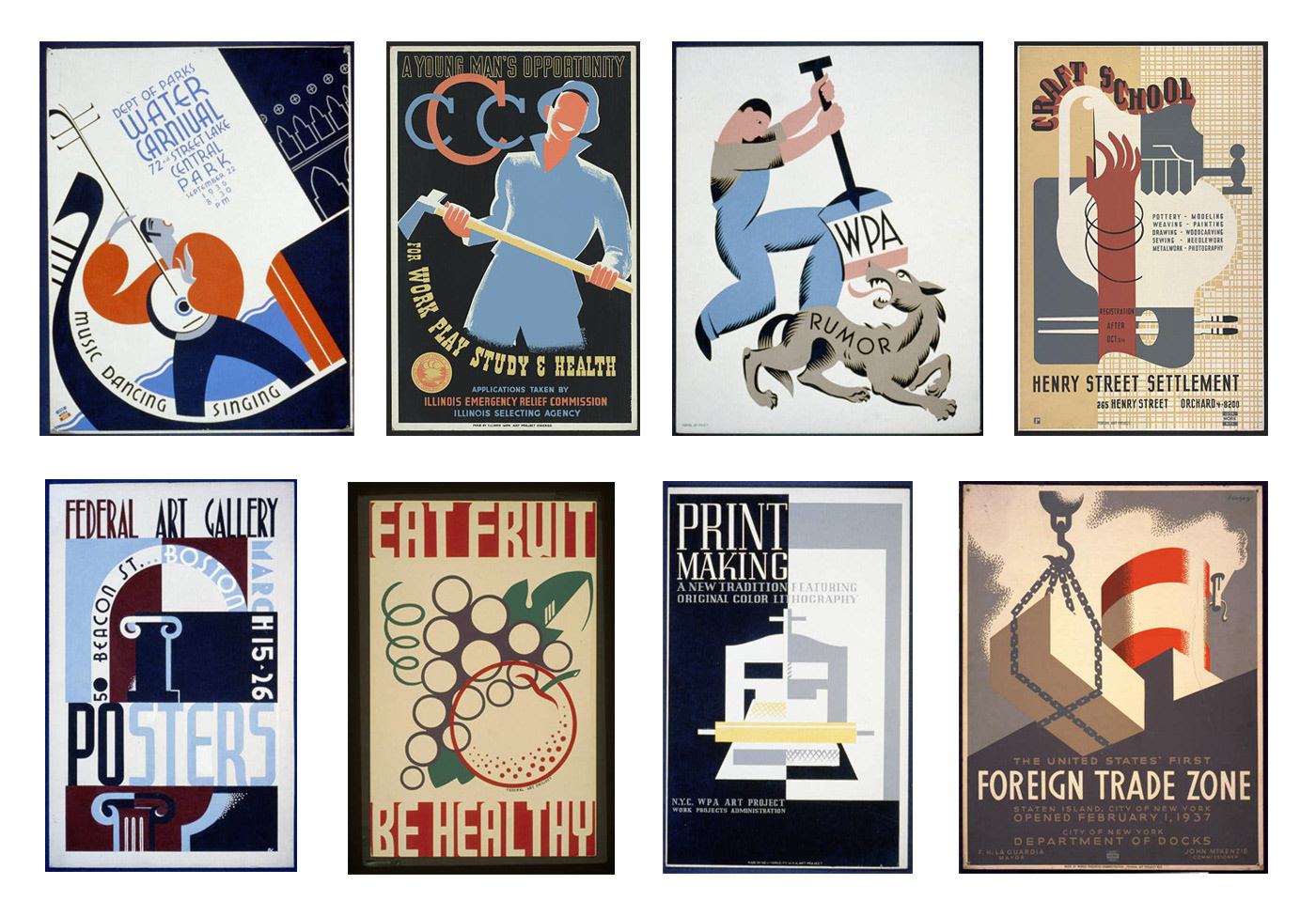
I adopted the streamlined cut-paper style for human forms frequently found in WPA posters shown above, and arranged the custom lettering to deliberately kiss the art's edges. I especially enjoy using white as a dynamic knockout color that bleeds out and creates an interesting, irregularly-shaped margin.
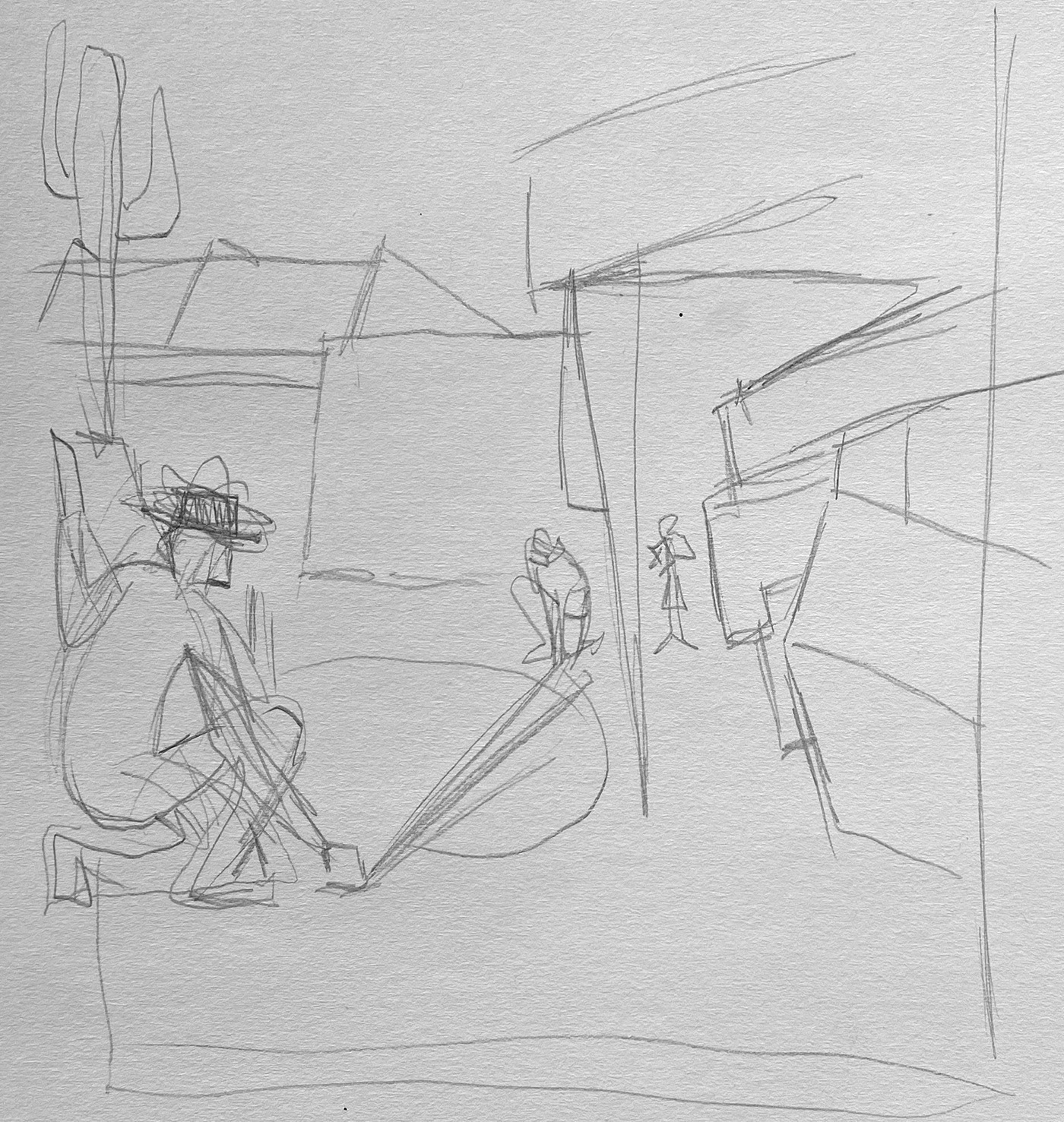
As an Arizona-born artist, it was my honor to design the poster for nearby Taliesin West. I used historic 1930s-era photography by Pedro Guerrero of workers at Taliesin building and interacting with the architecture, and the concept of continuing the spirit of Wright's Fellowship today as my inspiration. This subject has become particularly poignant in 2020 as the Foundation and School of Architecture at Taliesin debate whether or not to separate.

I decided that having too many people crawling around on the roofs like those in Pedro's photos made everyone look too much like cats!

I spent several hours at Taliesin to document the architecture and observe how people used the space today.
The posters were printed as giclée print on watercolor paper and sold as a fundraiser for the Foundation in 2019, then exhibited in Scottsdale, San Francisco, New York, and Spring Green. You may purchase the posters here.

I designed custom Illustrator Brushes just for this project to help describe the shagginess of desert masonry and take the edge off the crisp vector work.

The cloud forms echo Wright's signature Whirling Arrow motif, which is a symbol of cooperative fellowship.

The white heart shapes represent the white butterflies that flit through central Arizona in the springtime and suggest the blossoming of love between the male and female workers.

After studying Wright's own lettering style, I devised a custom lettering treatment to use for the poster. While Wright's tendency was to draw letters much like architecture, using perfect geometry, most typographers will tell you that this leads to unnatural lettterforms.
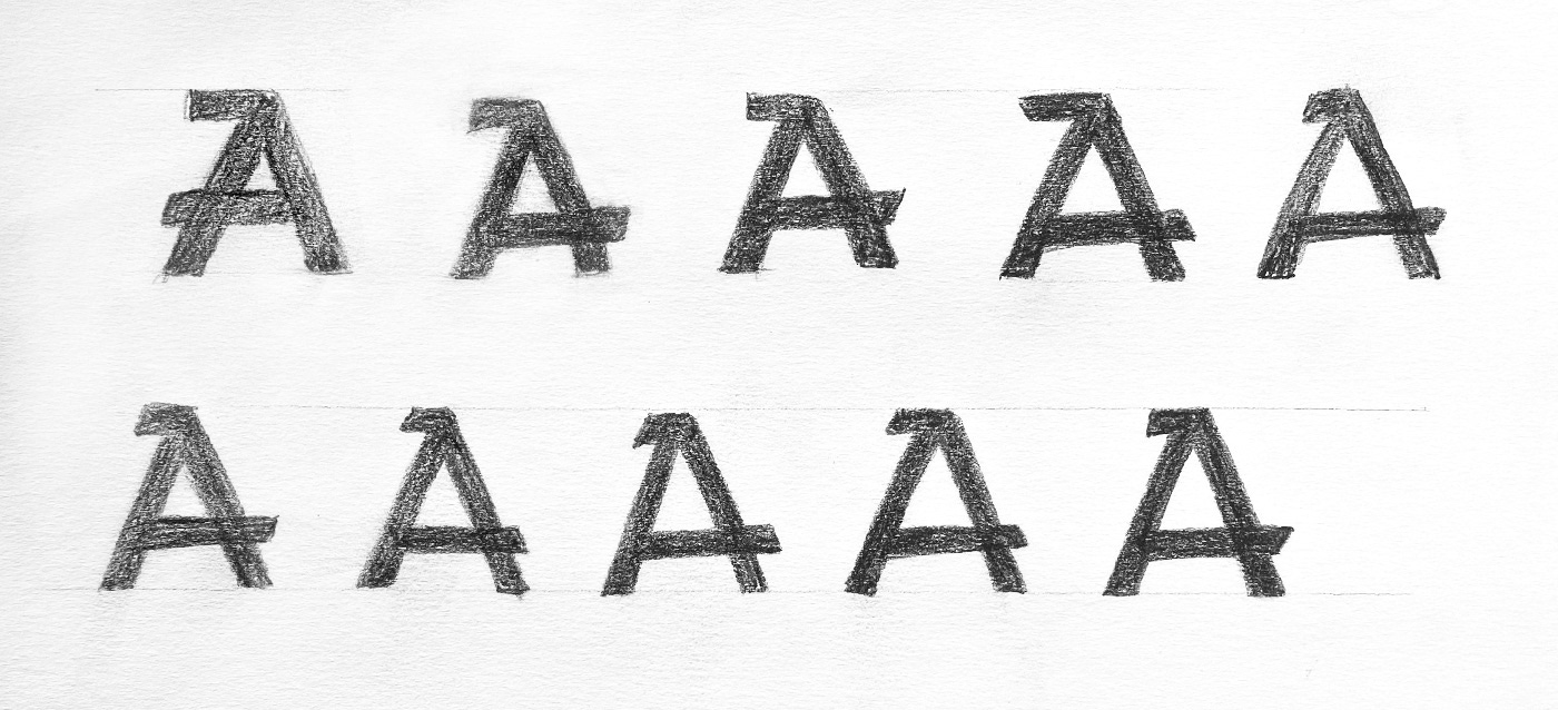
Many more humanistic variants were experimented with to achieve just the right balance of geometry and naturalism.

When the poster was complete, I extended the usefulness of the lettering by digitizing all of the glyphs and creating a new font well suited for use in the international food and beverage industry.

A selection of catchwords and alternate glyphs such as the smaller O and descending R offer the typesetter a lively variety of ways to compose phrases.