
Closing a campus is like burying a child. There's no way to do it without a lot of tears. in 2018, one of my design classes was tasked with designing an event and supporting collateral for the college's last public gathering and portfolio show, which we decided to call "The End". Due to the sensitivity of the sudden and tragic circumstances, the primary audience for this event was graduating students and their families, alumni, past and present faculty, and staff.
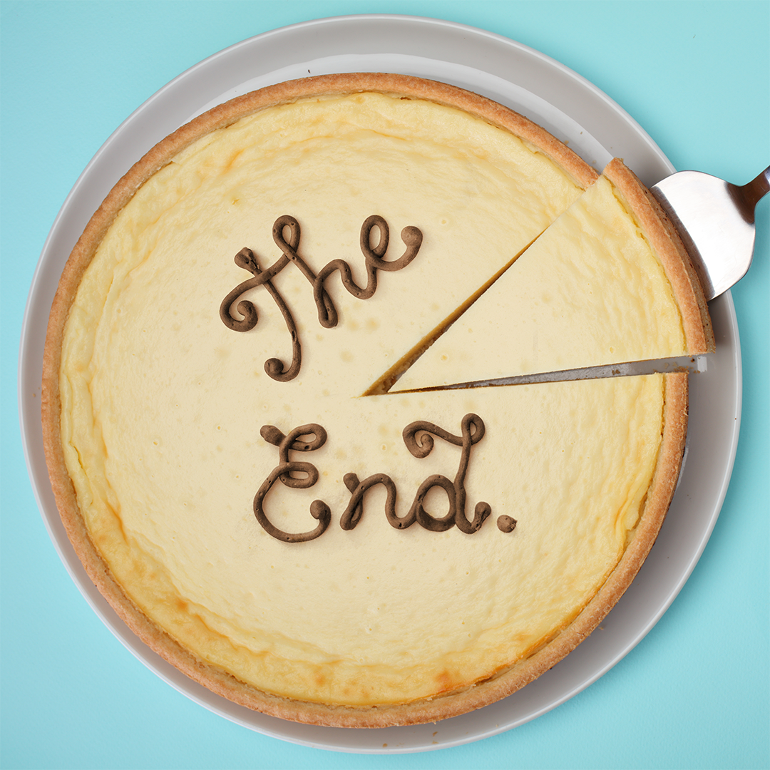
Yes, that is actual chocolate frosting! I actually got my start in lettering as a cake decorator. While the frosting is indeed real, the end result is a Photoshop composite.
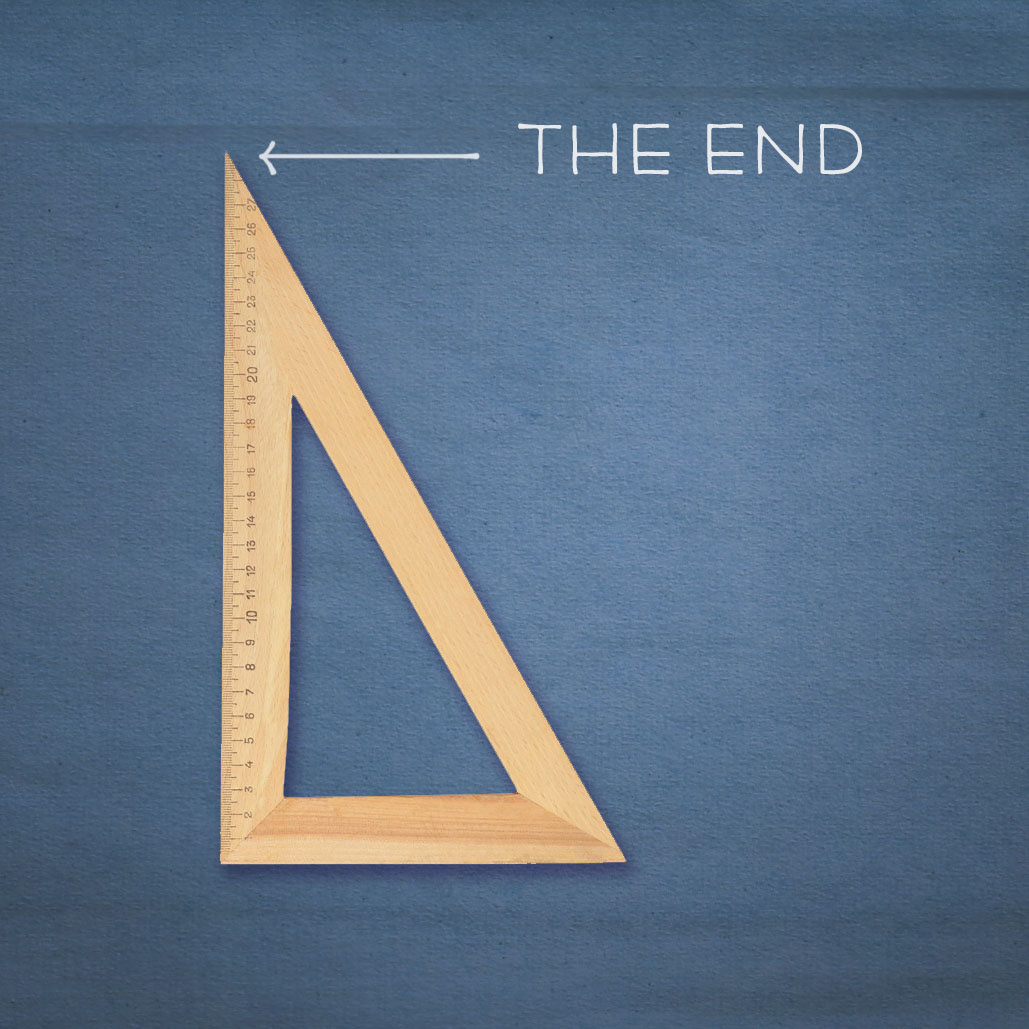
Watch out for the pointy end!
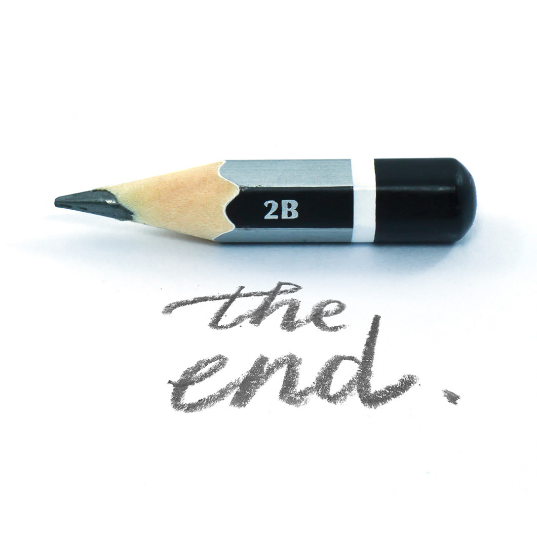
Real handwriting composited in Photoshop
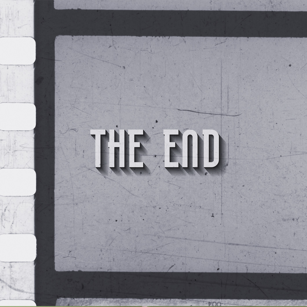
An old Hollywood style treatment to resemble end credits for the film department.
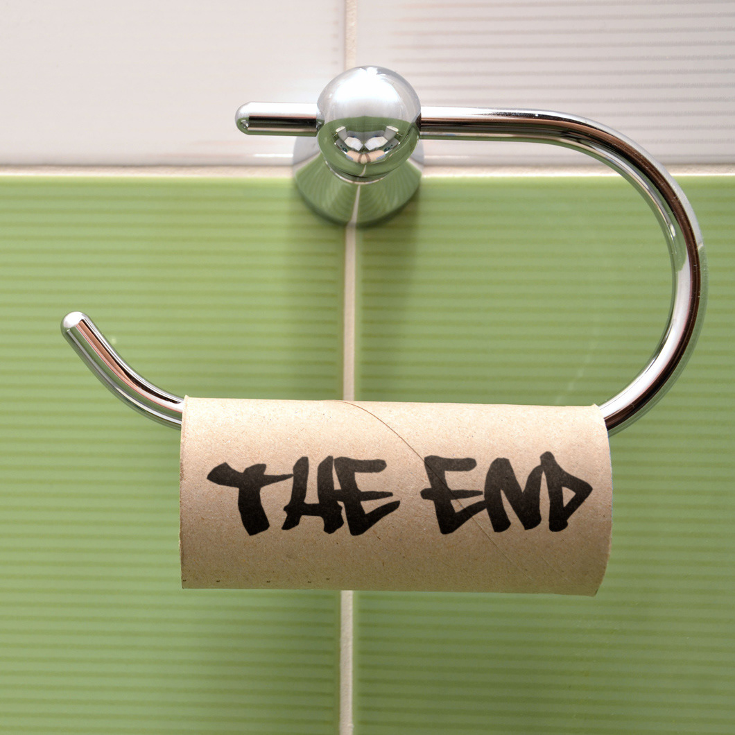
Toni Kannenberg came up with this clever art direction, which I executed using a graffiti font.
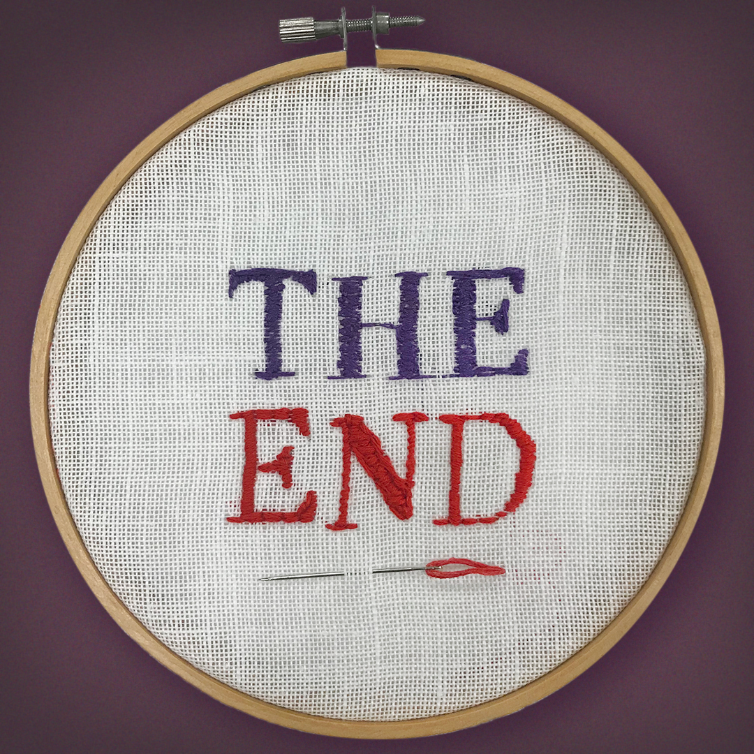
A fashion design student contributed this needlework based on art direction provided.
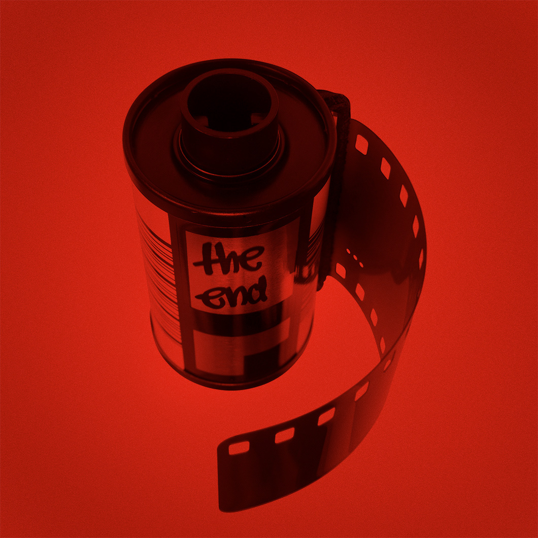
A darkroom treatment with Sharpie-inspired letters labeling a film roll.
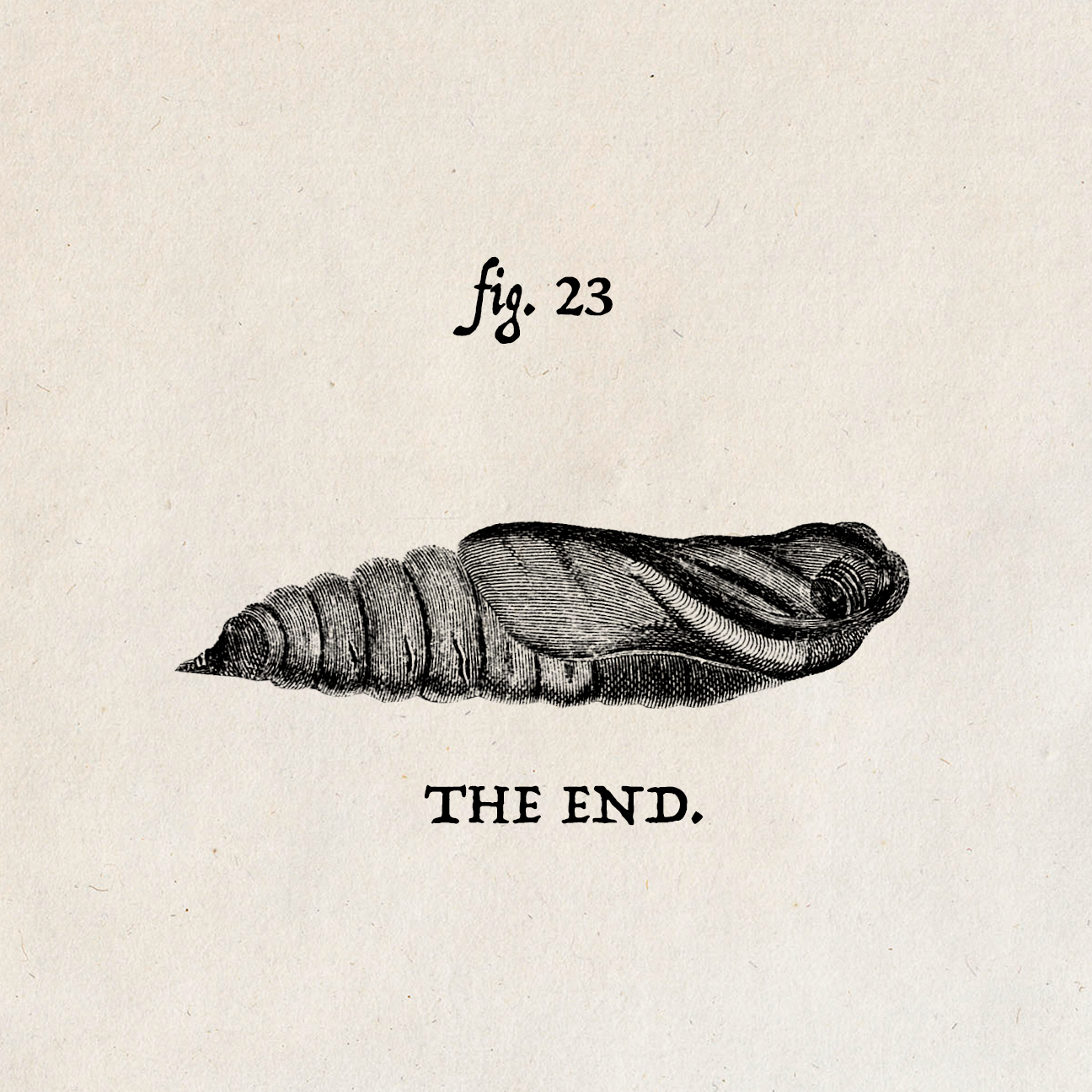
Royalty-free vintage engraving combined with vintage inspired font.
A team of students contributed concepts and execution for some of the social media and internal promotional images above, which represented many of the trades taught at the school: photography, film, interior design, fashion, graphic design, animation and culinary arts. Each department was represented by its own spin on "The End"; the last course of a delicious meal, the stub of a pencil, the end of a reel of film. Other graphics were simply meant for fun, as a metaphors for what "The End" could possibly mean.
The chrysalis was especially poignant as it also represents new beginnings. The butterfly image became an integral part of the event's theme.
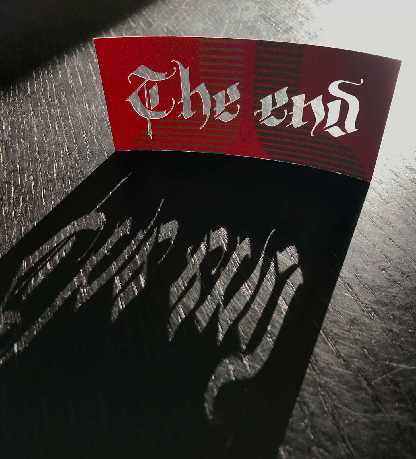
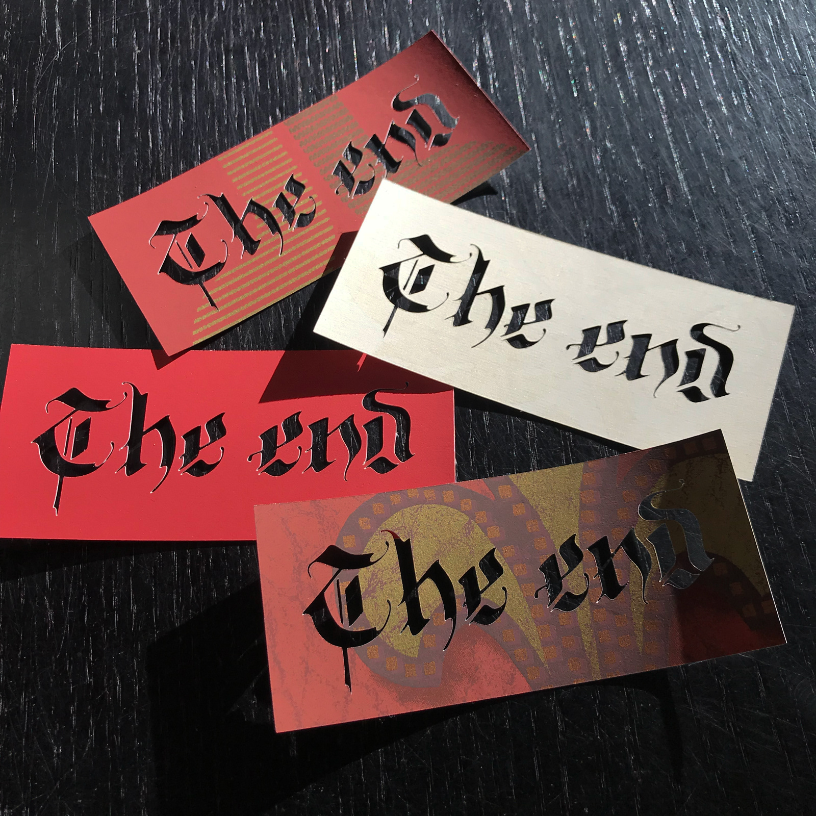
We raided the Interior Design department's obsolete wallpaper books and upcycled them into pocket-sized souvenirs using a Cricut. Due to the patterning on the wallpaper and positioning of the hundreds of cutouts, each souvenir was 100% unique. The Fraktur style calligraphy lent itself particularly well to this stencil-style application.