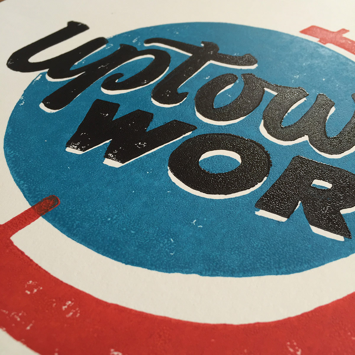
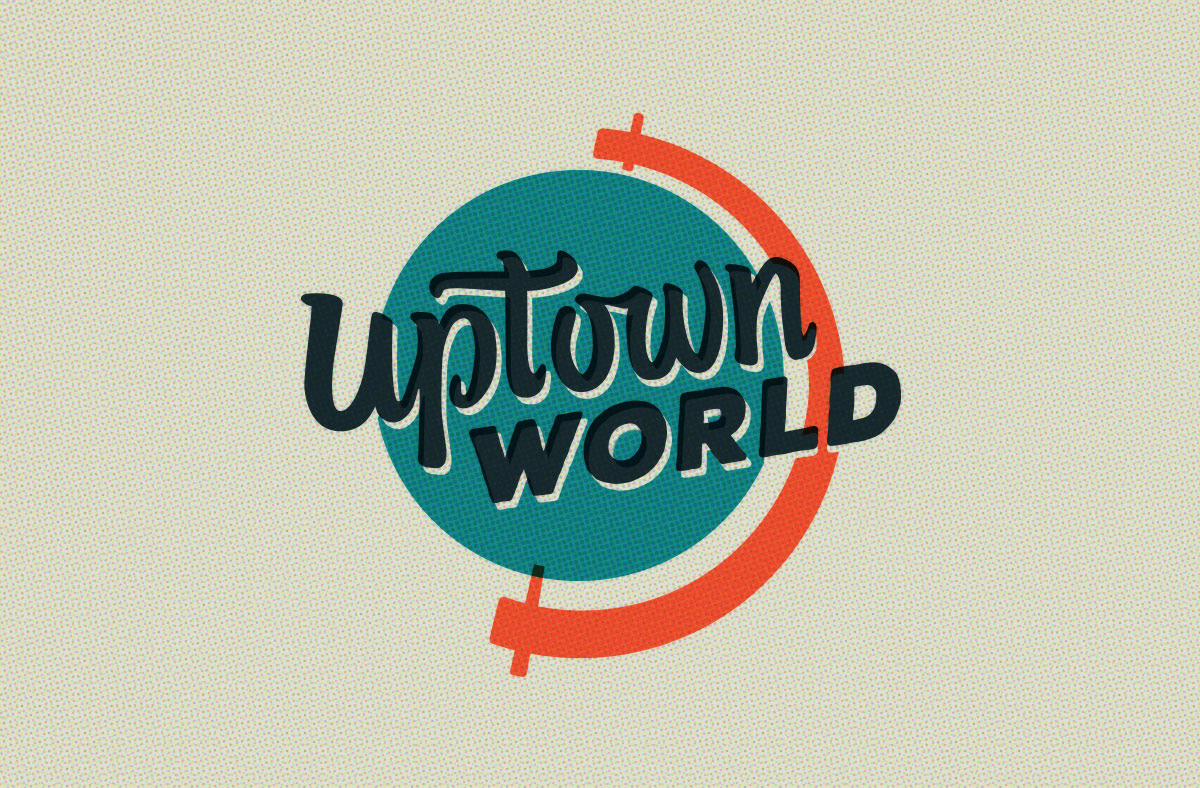
The Uptown World Campaign was designed to evoke a response of both nostalgia and curiosity by referencing Uptown Phoenix area icons both familiar and imagined. The logo mark, which was hand lettered, is a hybrid between the well-known vintage World of Cheese and Courtesy Chevrolet neon signs.
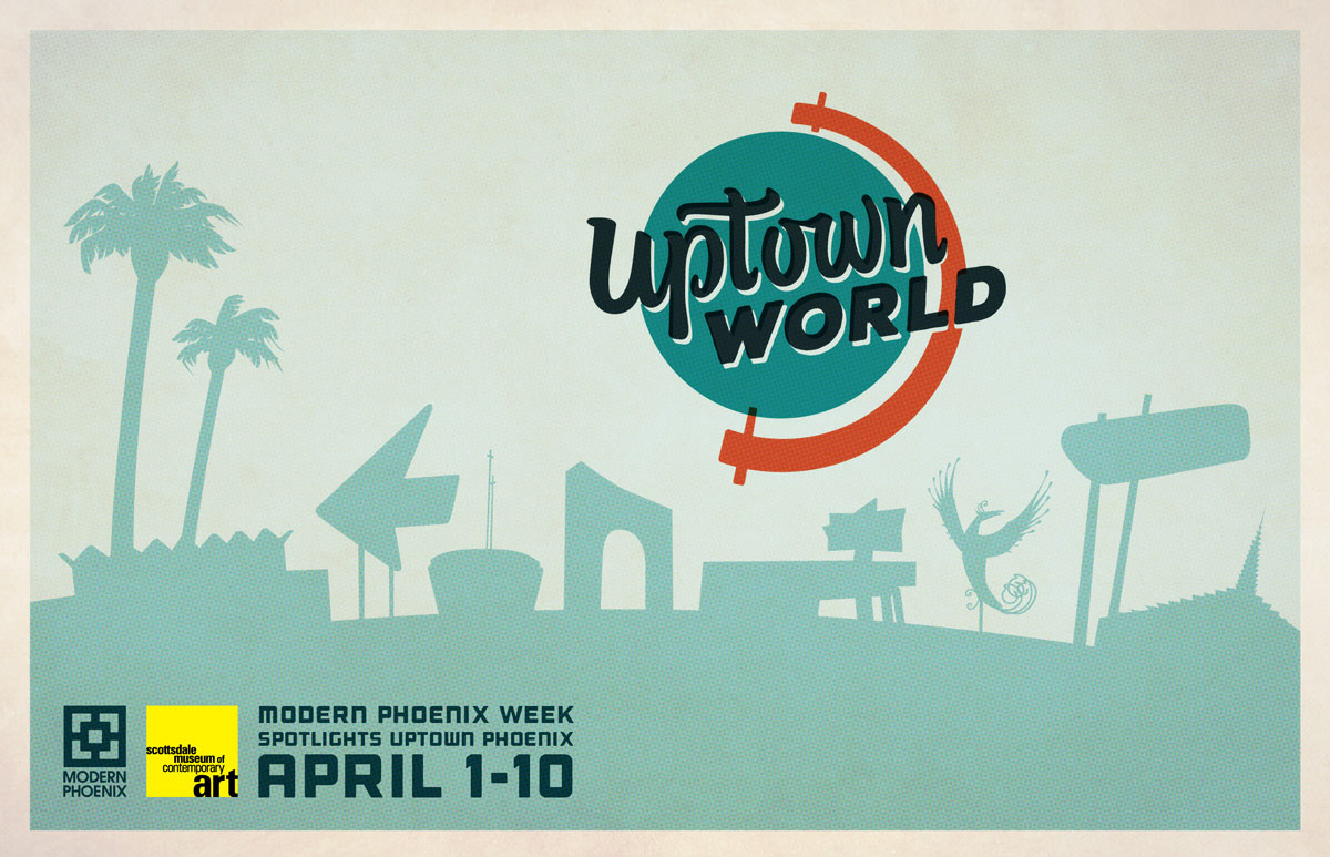
The postcard piqued curiosity by teasing the target demographic to see how many Uptown architectural icons they could identify by silhouette alone. The visual puzzle kept people engaged and guessing.
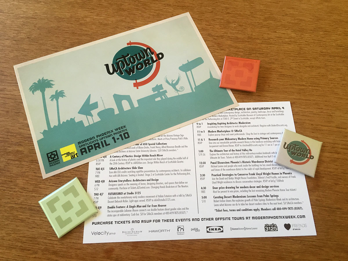
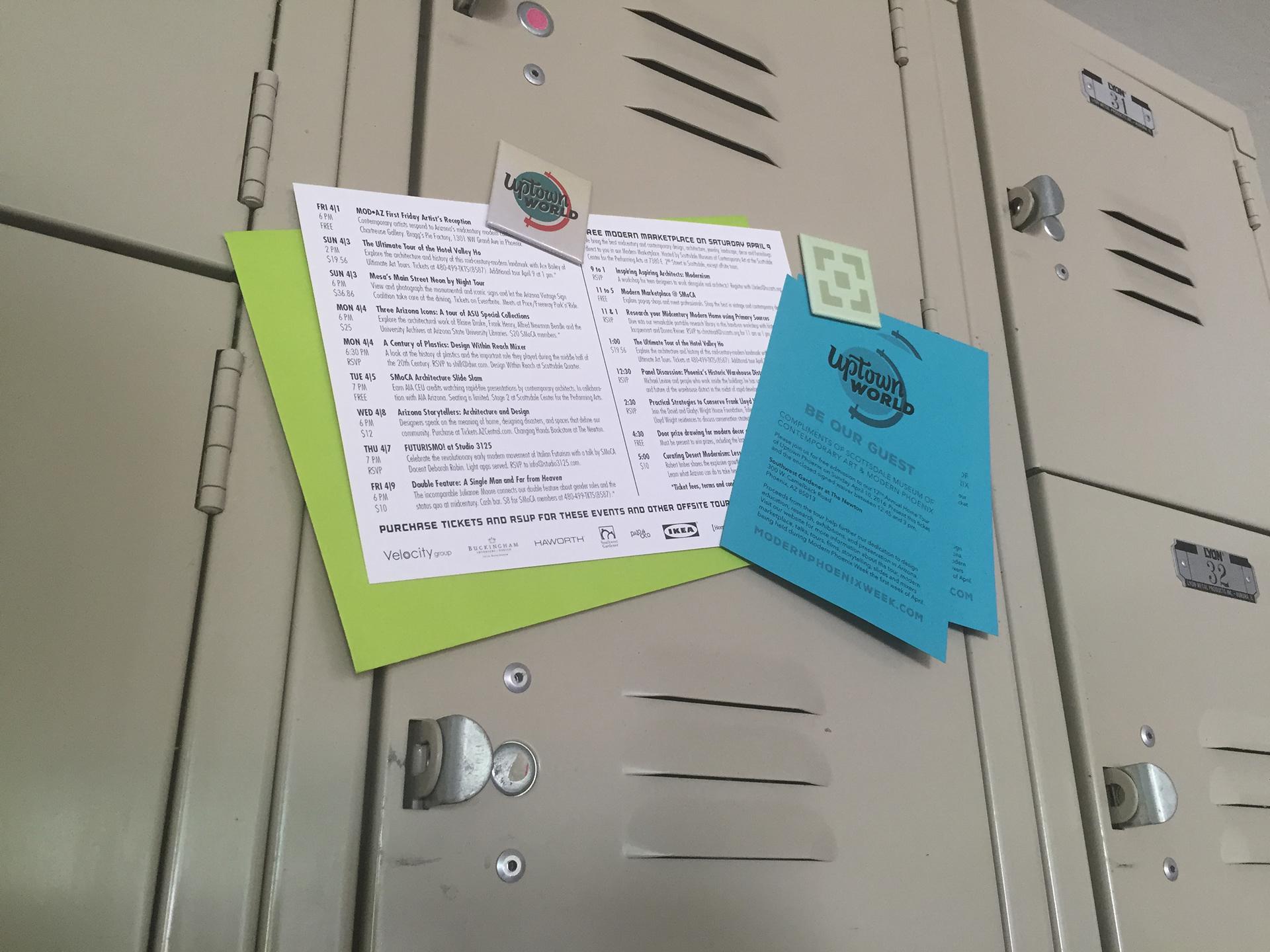
The week's agenda was distributed on pocket-sized cards around Phoenix Metro coffee shops, galleries, schools, furniture stores and vintage resale districts to directly reach the demographic of modern architecture lovers. Buttons and magnets were small treats given to volunteers and sponsors all week long.
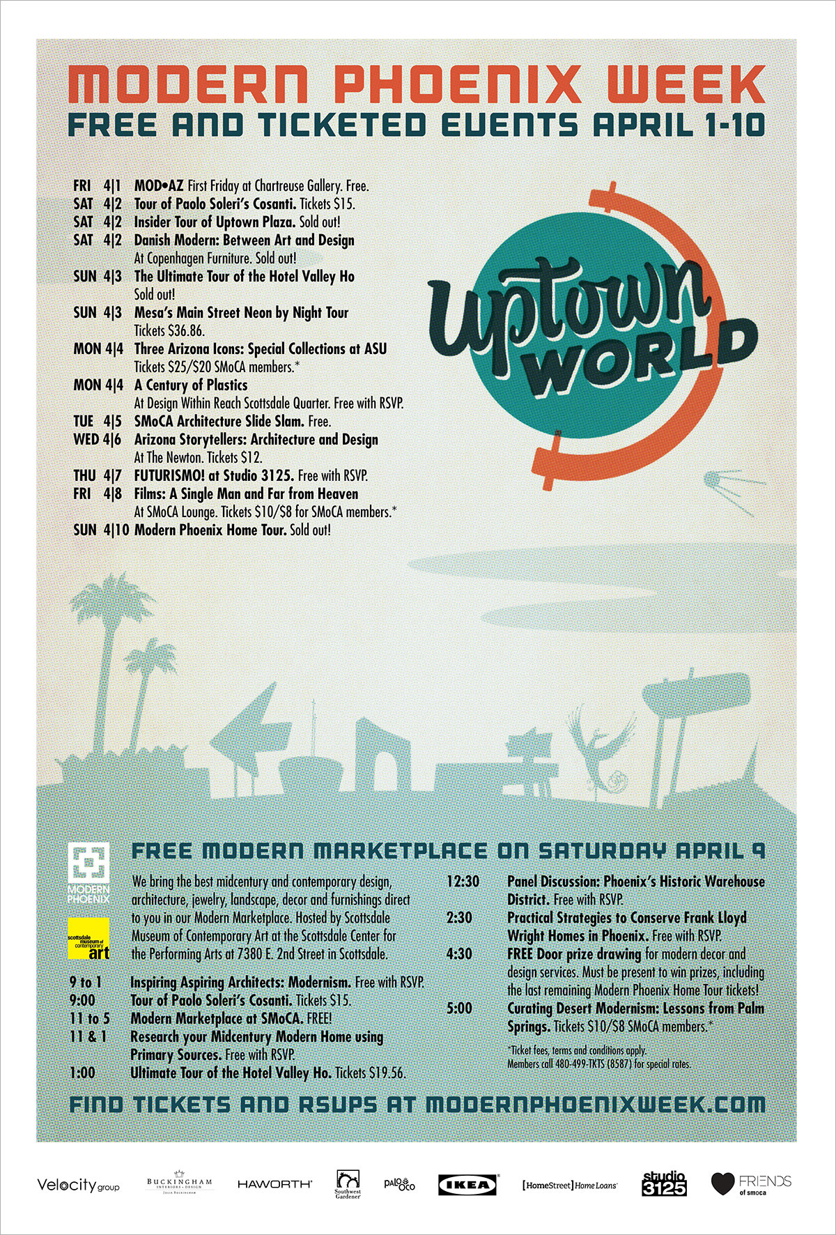
The event poster carried the same theme in a different orientation, and allowed room for a Sputnik easter egg in the sky. How many Phoenix area icons can YOU name in the silhouette?
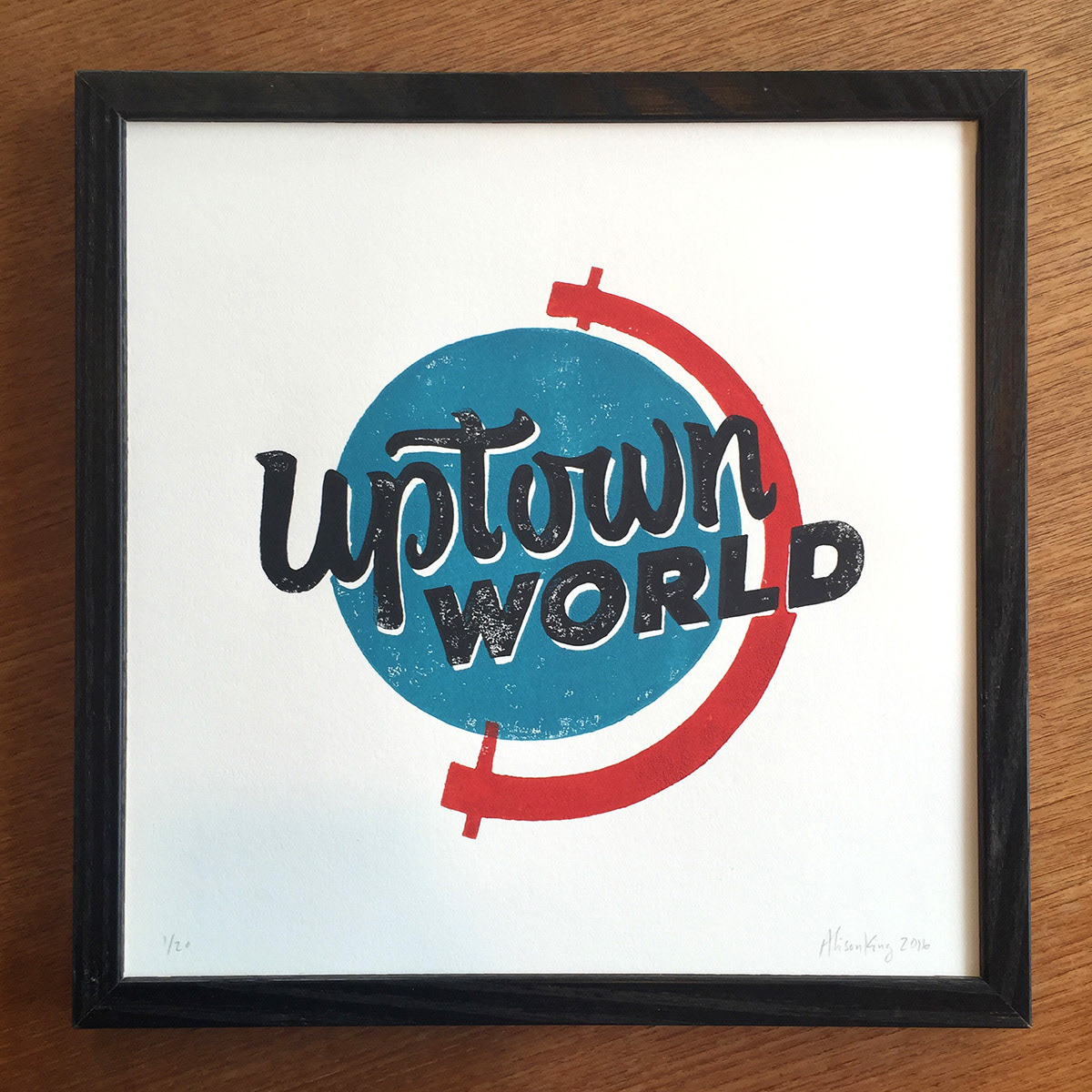
A special limited edition 12X12" block print was created to commemorate the event and was sold at the MOD-AZ art show. Each layer of ink was deliberately mis-registered by hand and featured unique textural combinations. The print is now available at the For the People shop at Central and Camelback in Phoenix.